


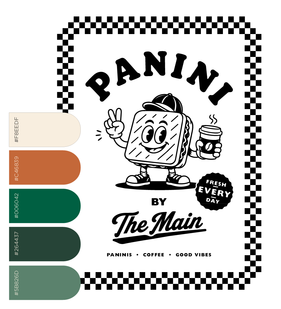
Creating a new identity with its own flavour, while staying connected to an established brand.
Panini by The Main was developed as a new offering from The Main, with the challenge of creating a brand that could stand confidently on its own while still feeling connected to the established venue.
I developed the visual identity from concept through to execution, drawing inspiration from classic New York Italian eateries and giving it a contemporary, approachable edge. The identity needed to feel distinctive enough to build its own recognition, without competing with The Main or feeling disconnected from its existing environment.
A bold hero colour was introduced to give Panini an immediate visual presence, supported by a deliberately simple palette that could translate efficiently across signage, packaging and printed collateral.

The Brand
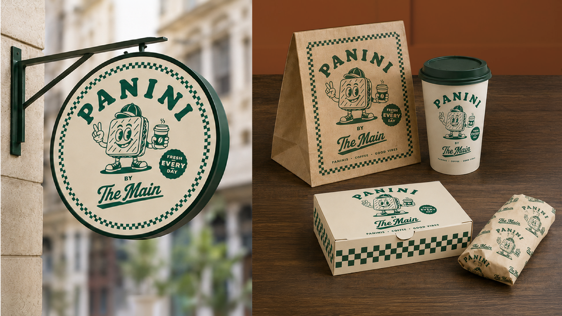
The brand was considered within the physical space as much as on the page. Signage was designed to create street presence and clearly identify Panini as its own offering, including a circular illuminated projecting sign that complemented The Main’s existing signage rather than overpowering it.
Packaging was also developed with production in mind, using a streamlined one-to-two-colour approach that maintained strong brand recognition while keeping printing practical and cost-effective.
The result is a flexible sub-brand with its own personality and visual language — unmistakably Panini, while still belonging to The Main.
What Sets Us Apart
People-First Approach
Everything we do is built around understanding your needs and helping you succeed—because when you thrive, so do we.
Long-Term Relationships
We’re not just here for the now. We love creating lasting relationships with our clients and growing with them over time.
Proven Process, Flexible Execution
We bring structure where it counts and adaptability where it matters. Our methods are clear, but always responsive.