Brand Identity & Creative Direction
The Pavilion | WACA Ground
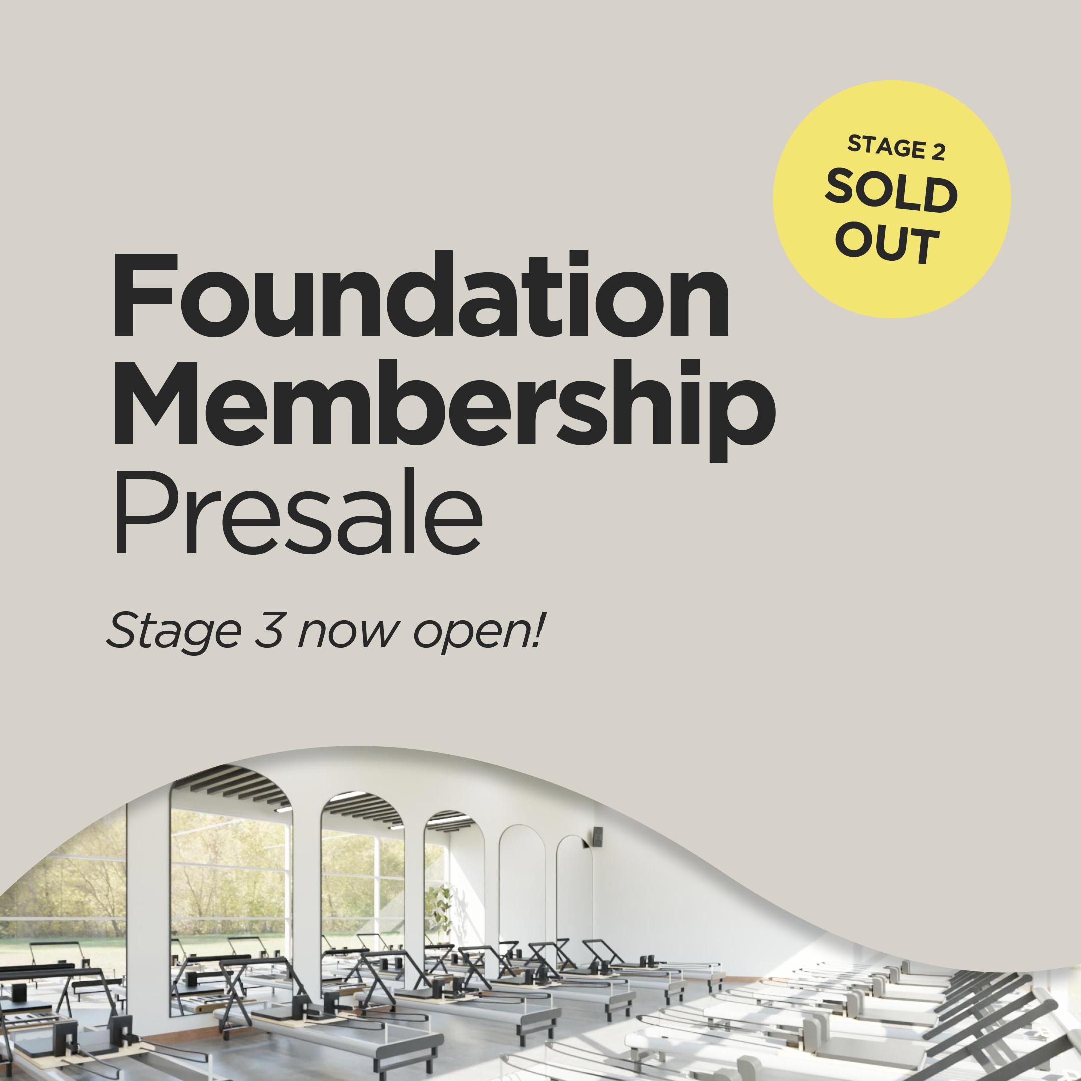
The branding has been created with an elegant design element that suggests movement and flow, echoing both the aquatic nature of the facility and the rhythm of physical activity. It also draws inspiration from the curve of the black swan’s neck from the WA Cricket brand to reinforce local identity and continuity. The slight delicate yellow below represents the sunny WA sunrise — qualities that reflect the journey of wellness and transformation.
Typography is bold and modern, the lettering conveys strength, resilience and clarity.